AdventurizeMe
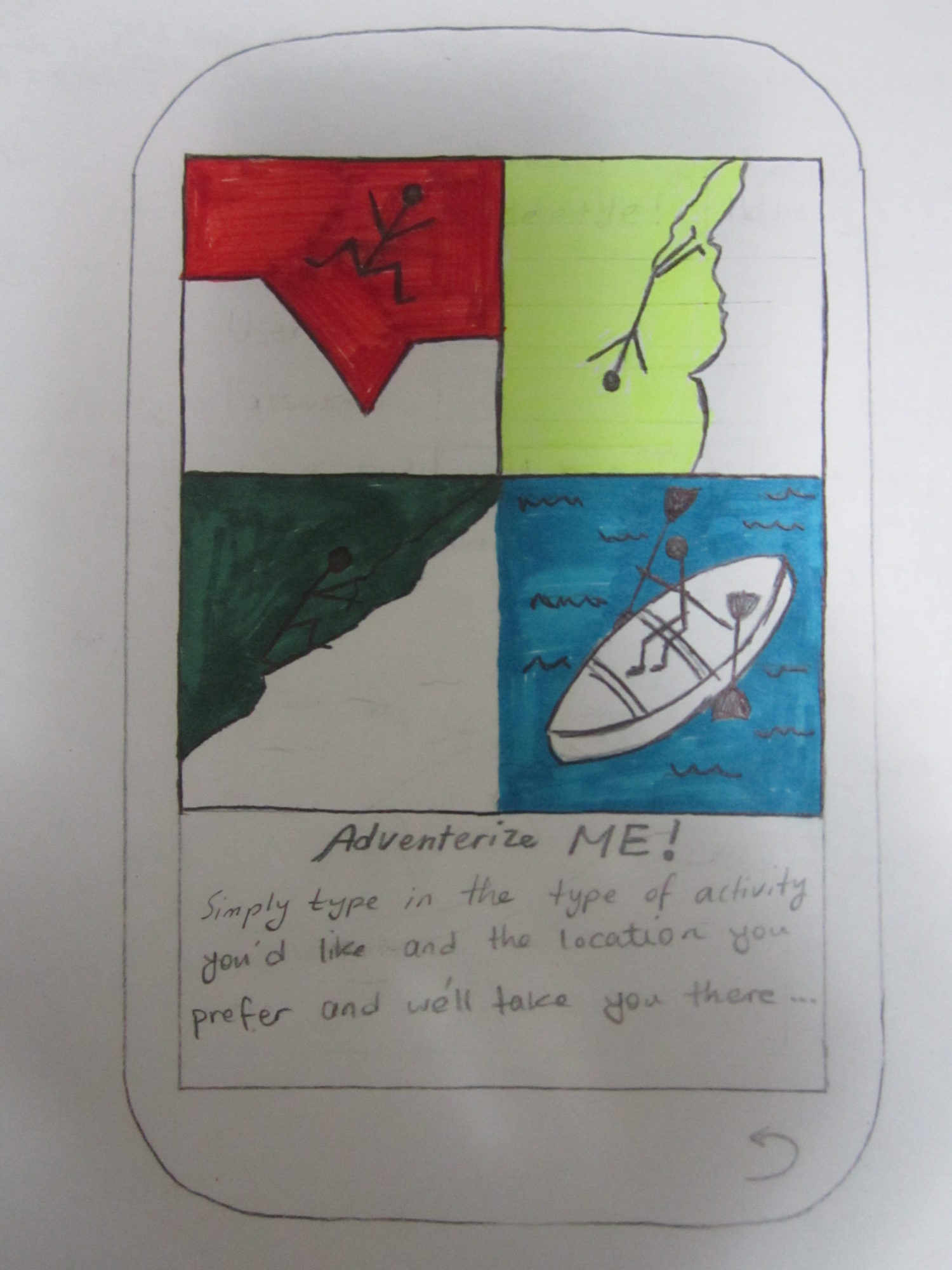
AdventurizeMe was a mobile application for people to be able to plan their next adventure. This was a school project for our User Interface Design course and I worked on the paper prototype of the application. For the logo, I went with a simple idea of four different activities. Simple black lines create a contrast with the vivid colors chosen for the background of each section. For the name of the application, we chose “AdventurizeMe” which we thought is a good word mashup of the making a verb out of the word “adventure”.
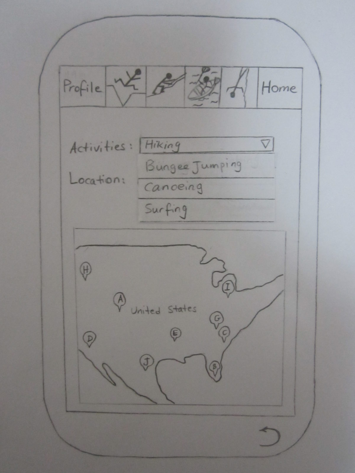
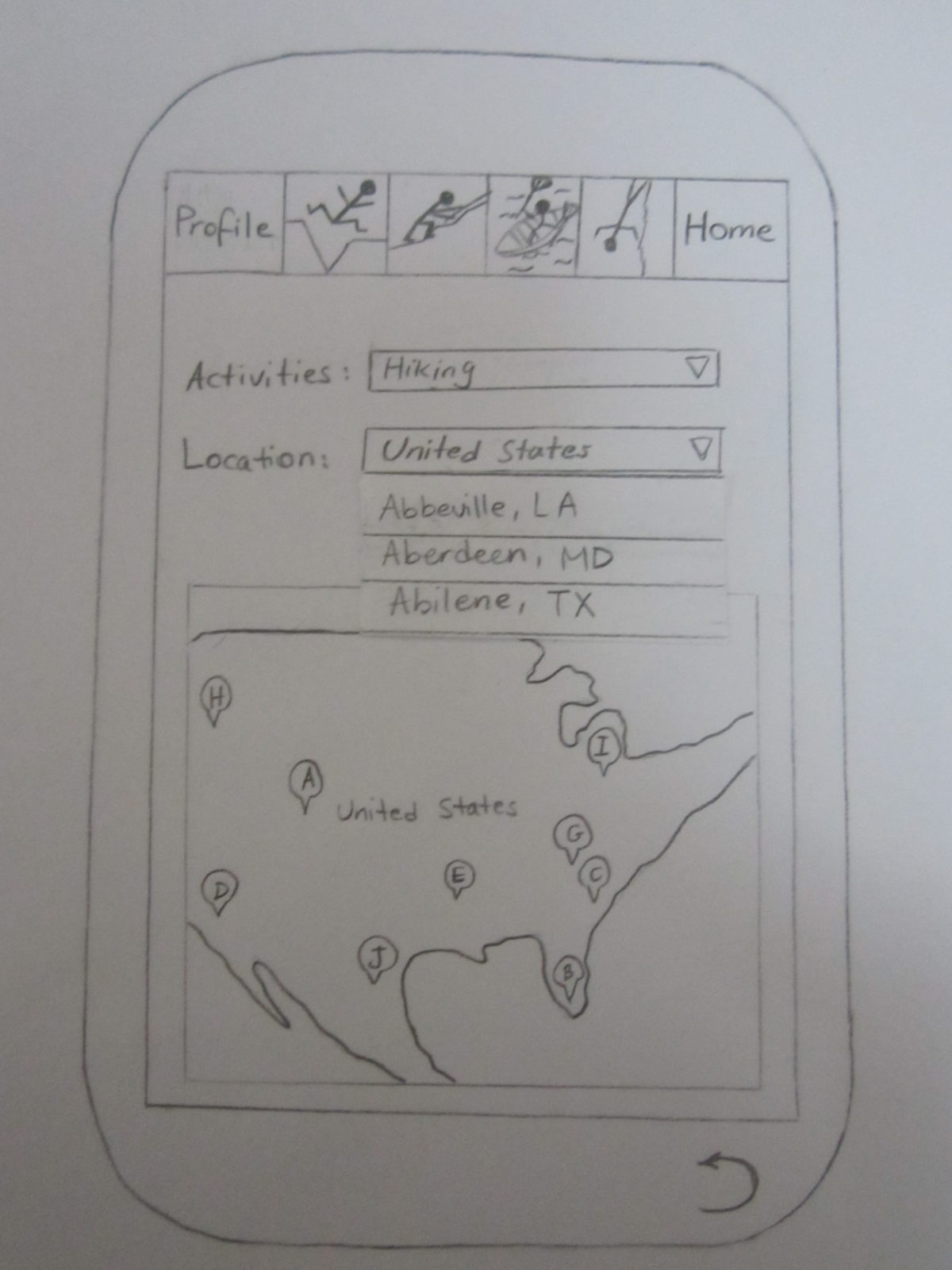
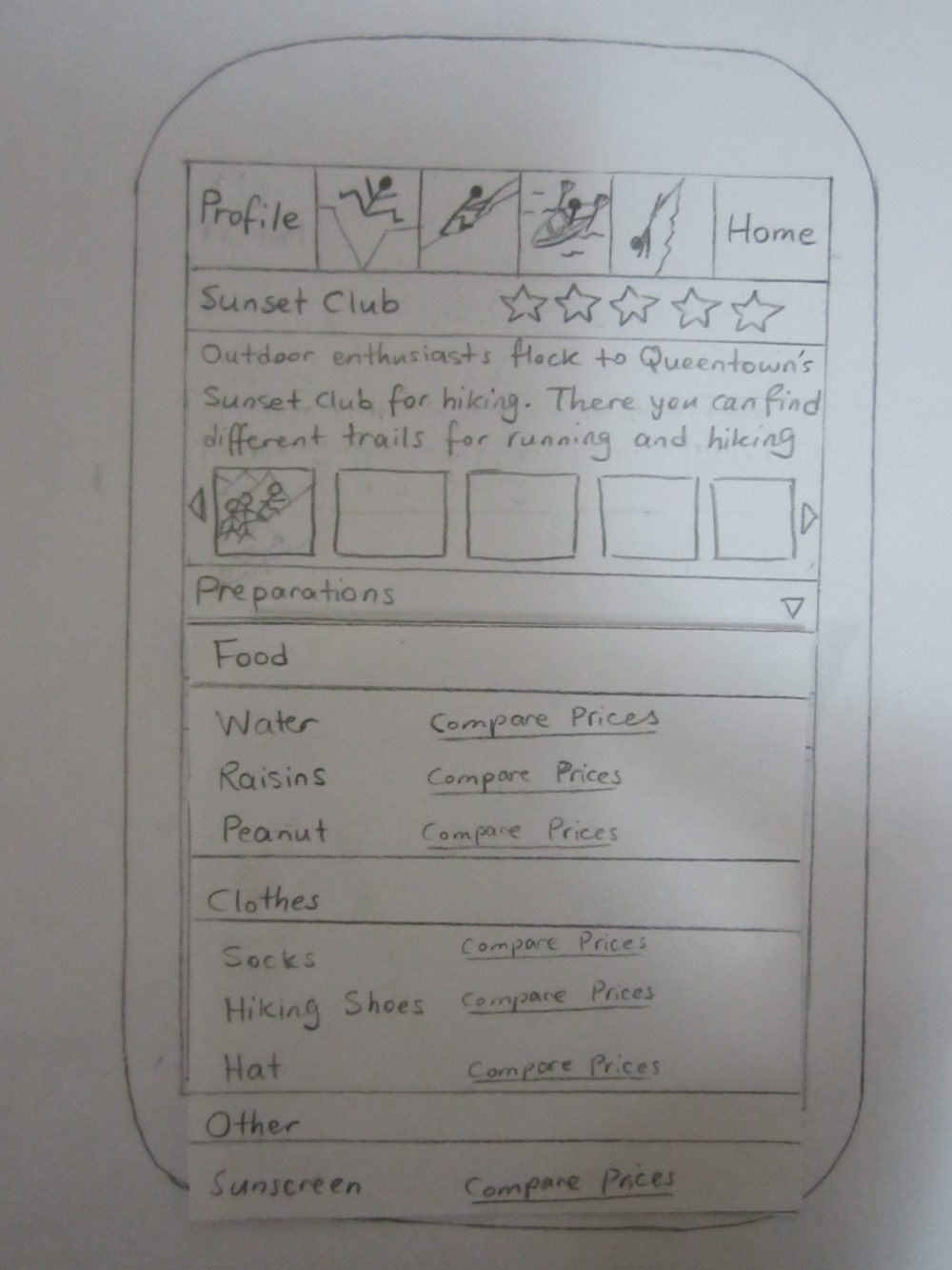
The paper prototype, as seen in the slider below, consists of several pages. The first page is where the user can select the type of activity he wants to do and the location he wants to go to. There is a Google Maps at the bottom of the page that shows all those activities that are available in that particular location. Later on, after the prototype was tested by the users, we realized that the words “My Account” and “Guide Me” are kind of ambiguous and not straight forward. Therefore, we changed the wording in the next iterations.
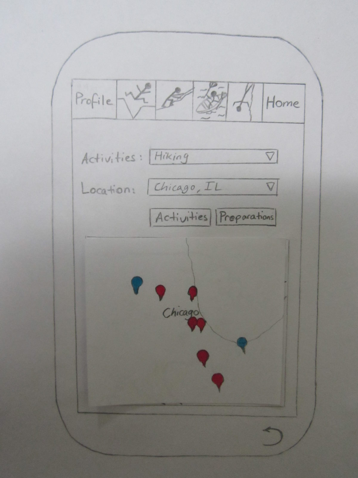
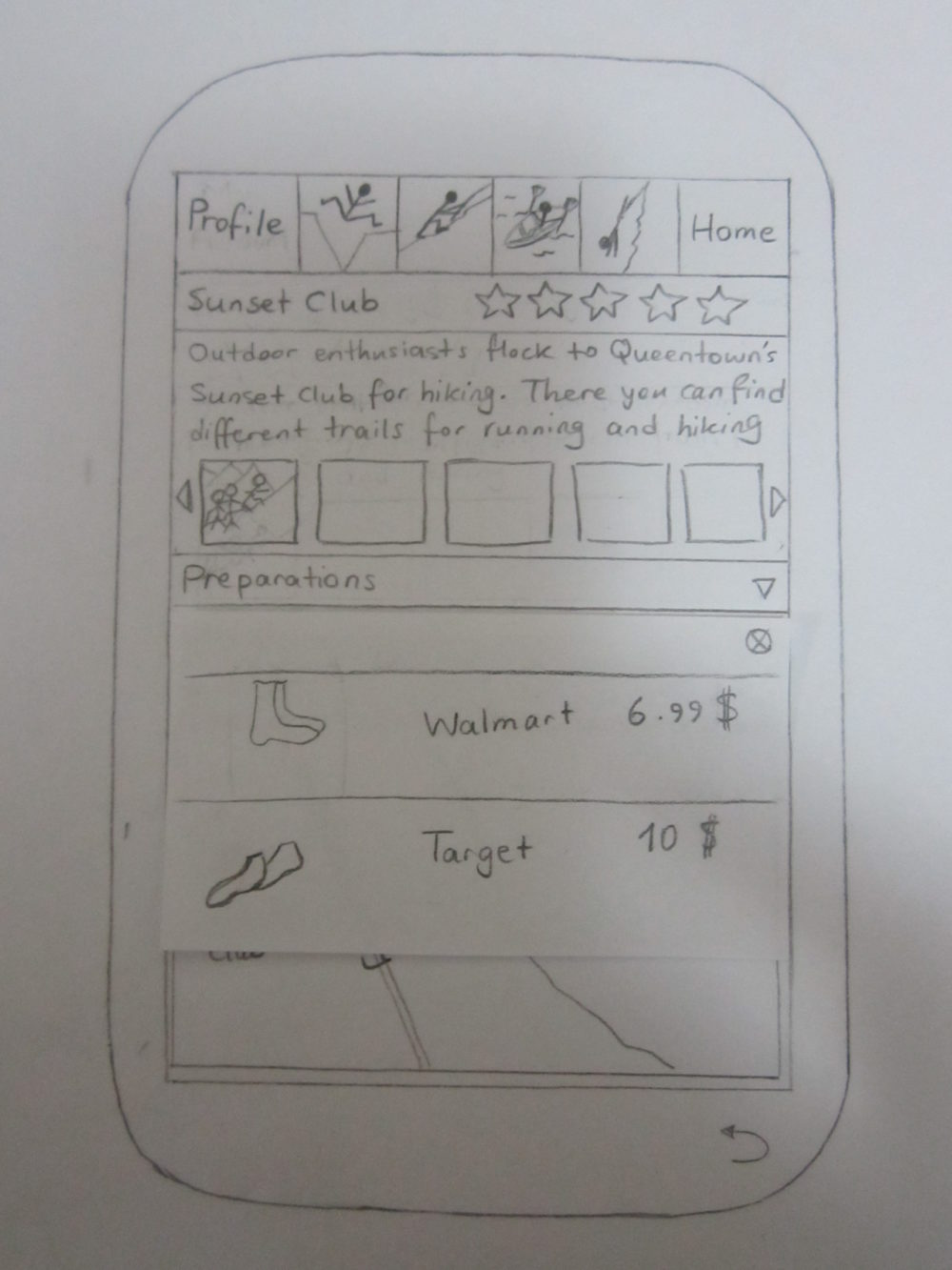
After having the first draft of the location selection page tested by the users, they said that they would’ve liked to see the “Preparations” button here as well as the “Activities” button. Simply because they may have already known about the place and they just want to get some information about what equipment they need to have for that particular activity. In the second iteration of the paper prototype, we also colored the location pointers differently based on the ones that have already been visited by the user.
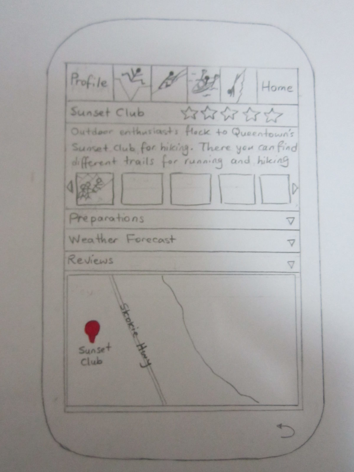
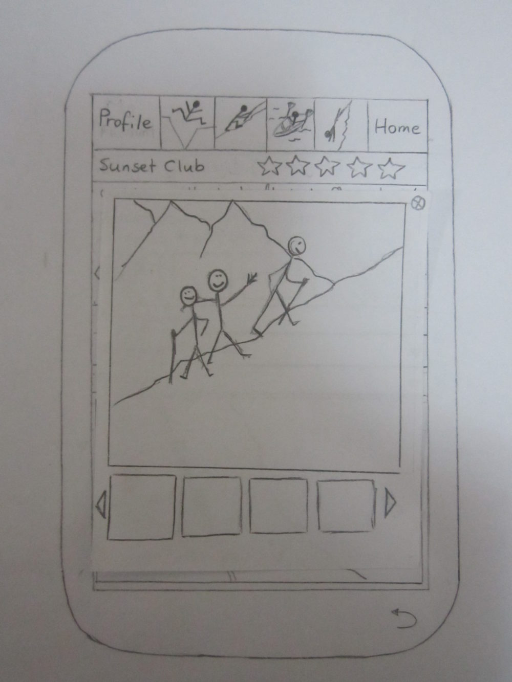
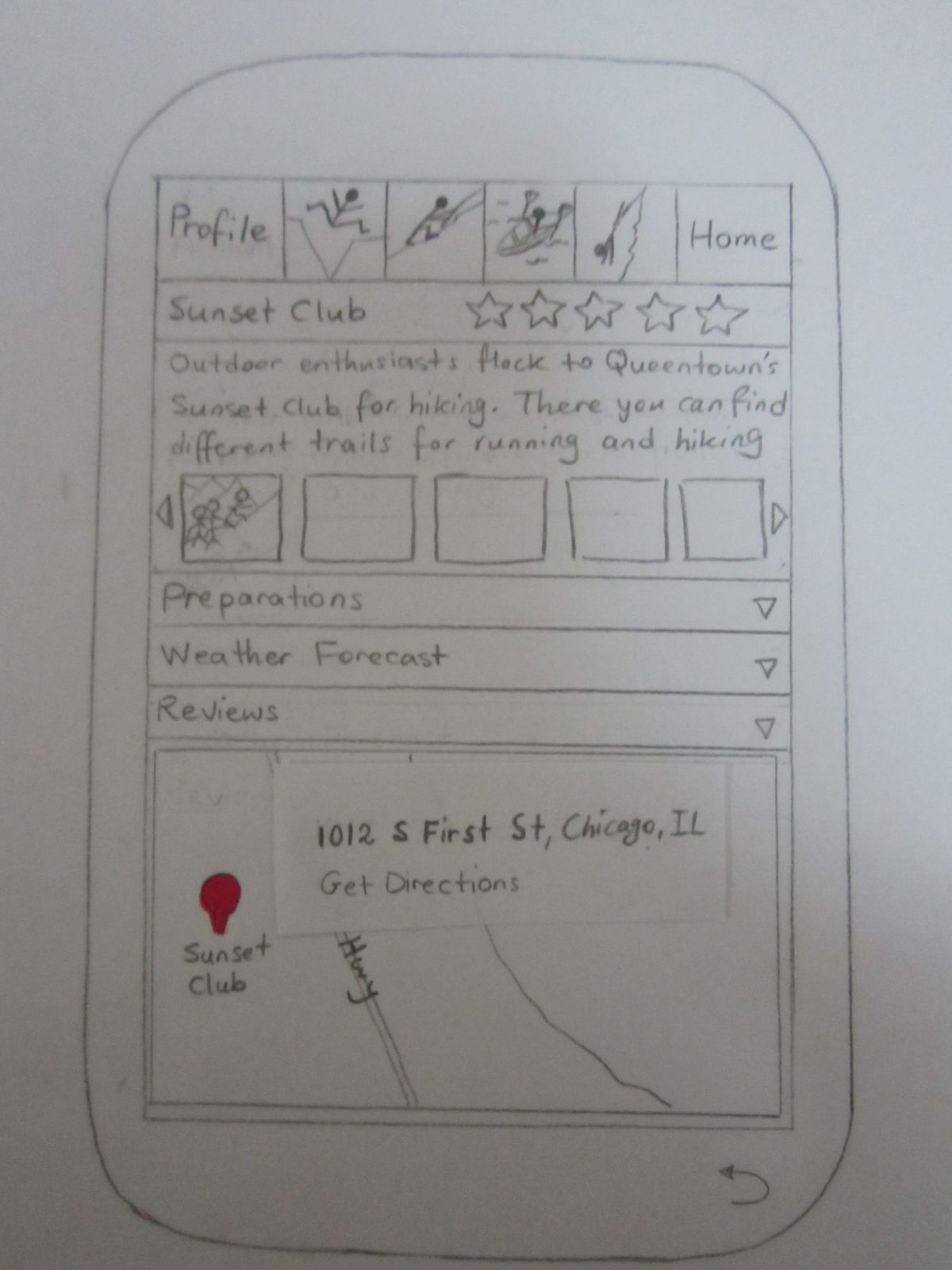
After clicking on one of the pointers on the Google Maps, the user will be redirected to the next page, which is the Activity page. Except the wording and the layout, this page didn’t change that much in the next iteration. The only significant change that was applied to this page is the integration of Google Maps at the bottom of the page. We thought that users may want to go directly to the “Get Directions” part, rather than reading about the activity and clicking on another button or link to get there.
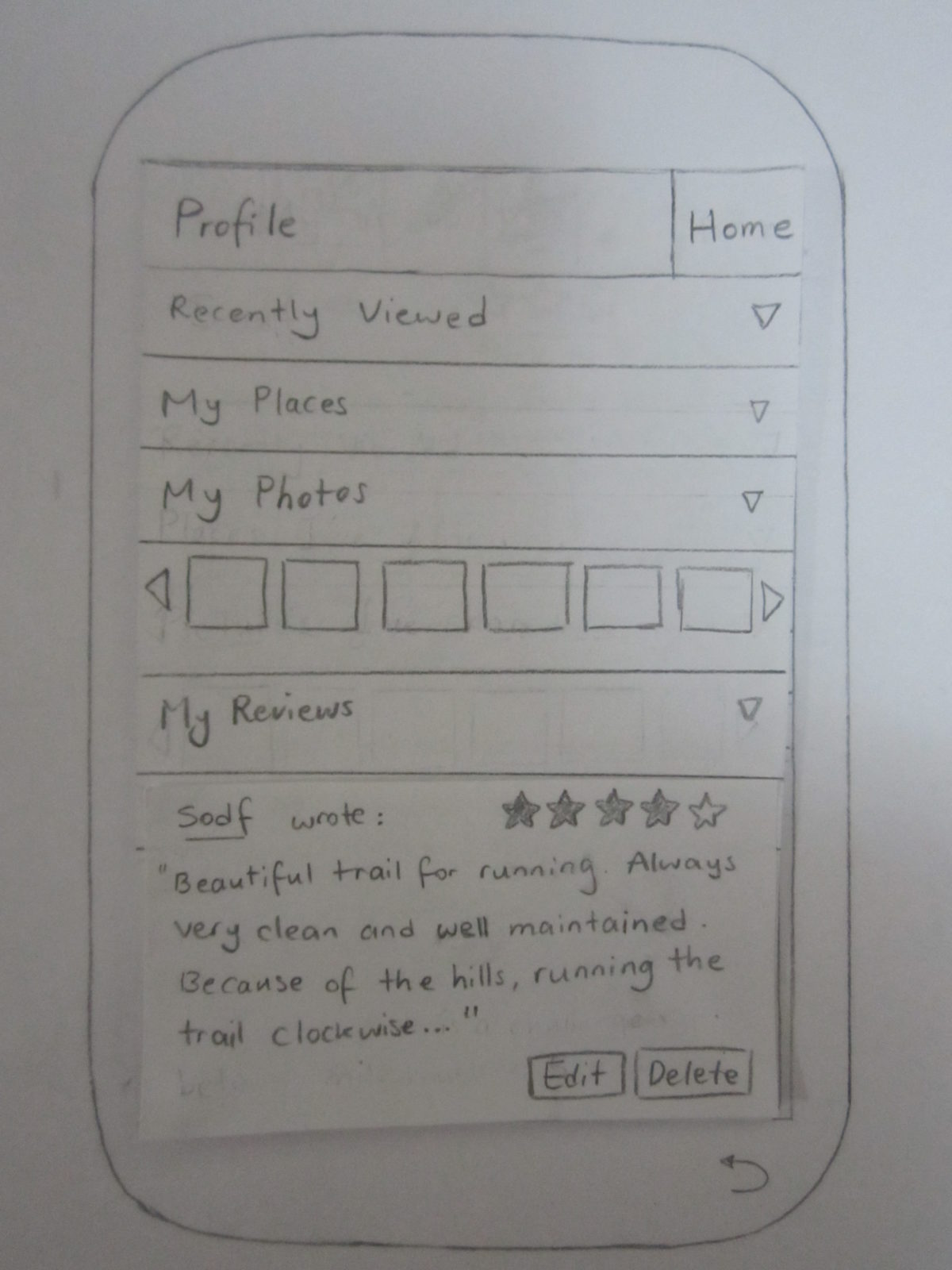
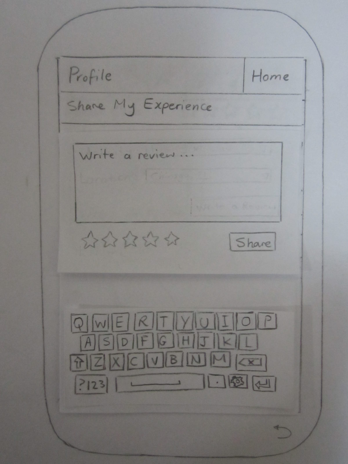
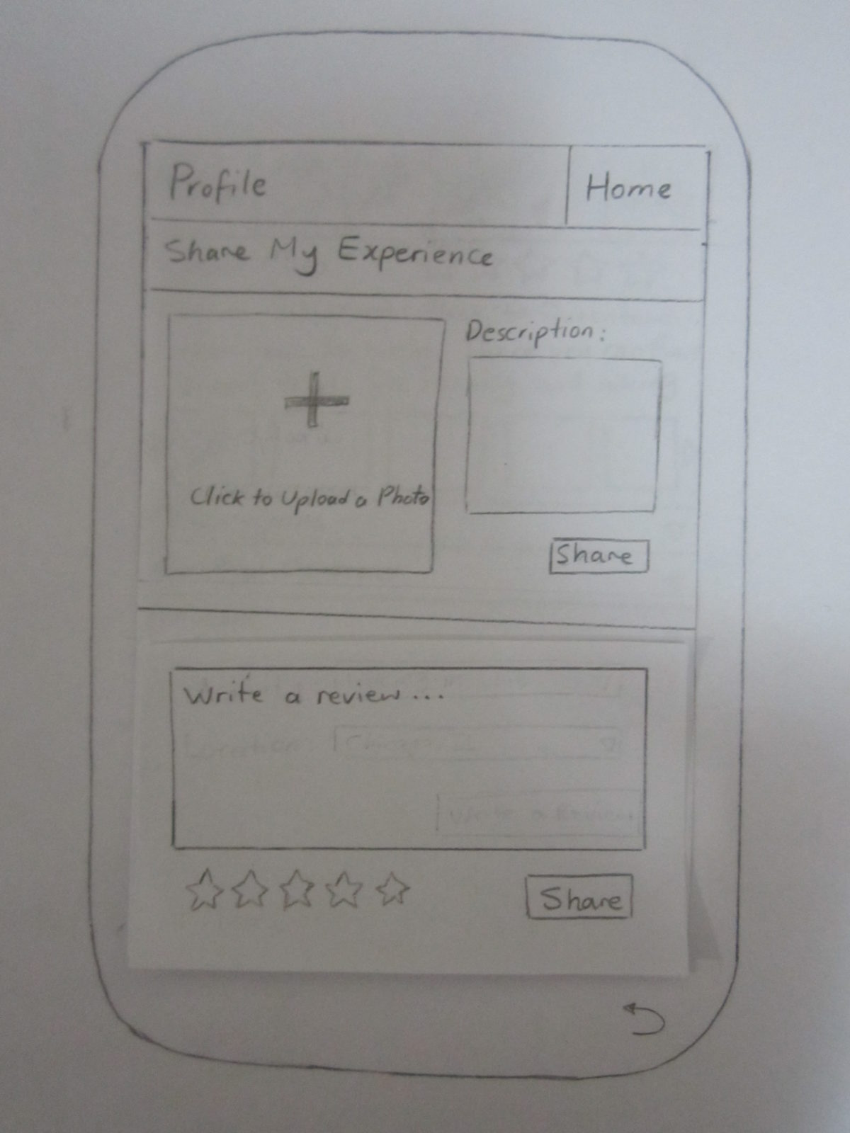
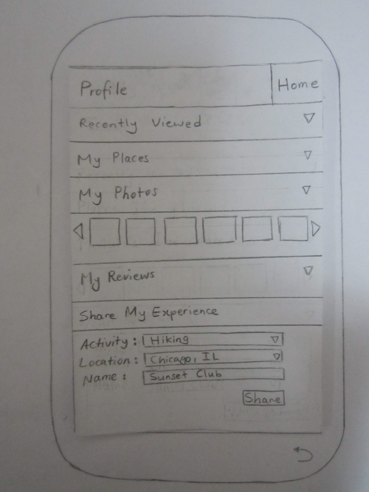
In the beginning, we had the “Writing a Review” part embedded inside the profile page which we later found out is very problematic. Users simply don’t associate writing reviews with profile pages. Therefore in the next iterations we changed the location of “Writing a Review” to the activity page. We also had both “Uploading a Photo” and “Writing a Review” under the “Share My Experience” tab, which again wasn’t successful with the users. When asked to upload a photo, they didn’t have any idea they have to go to the “Share My Experience” tab to do so.
After successfully posting a review, the users will be able to see their reviews in the profile page, under the “My Reviews” tab.


